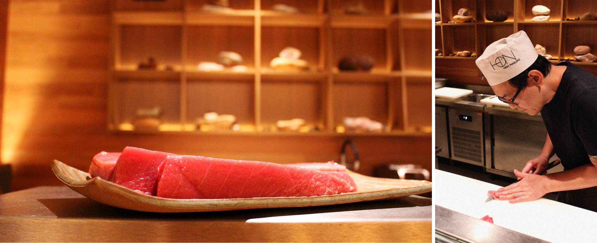
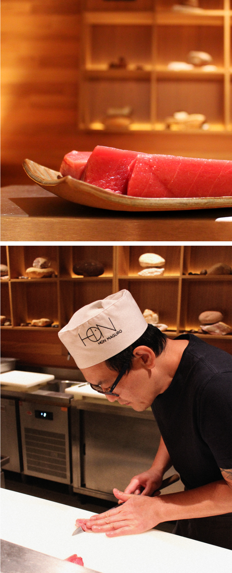
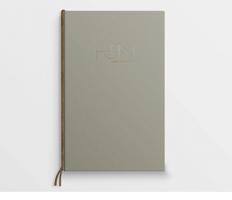
Hon Maguro
Editorial
Digital
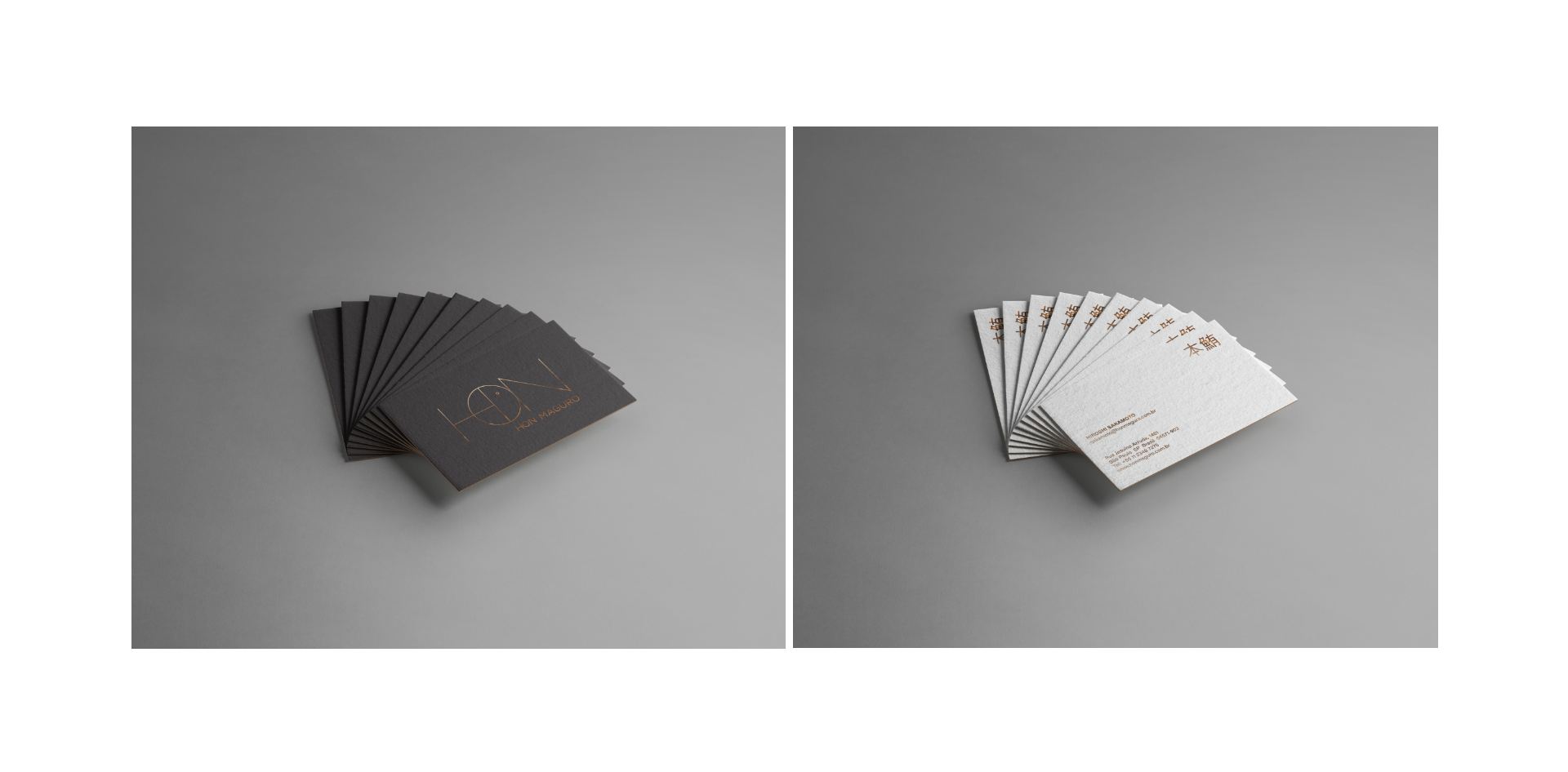
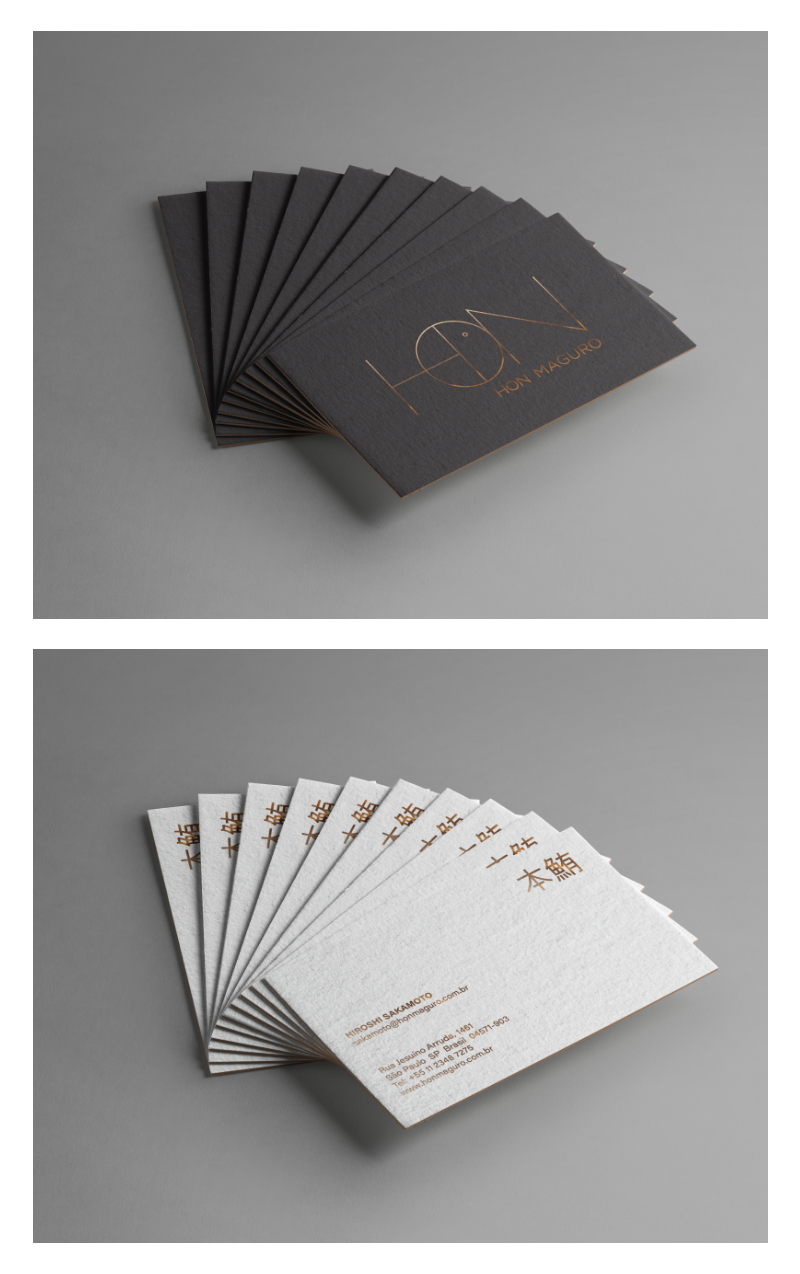
Corporate Id.
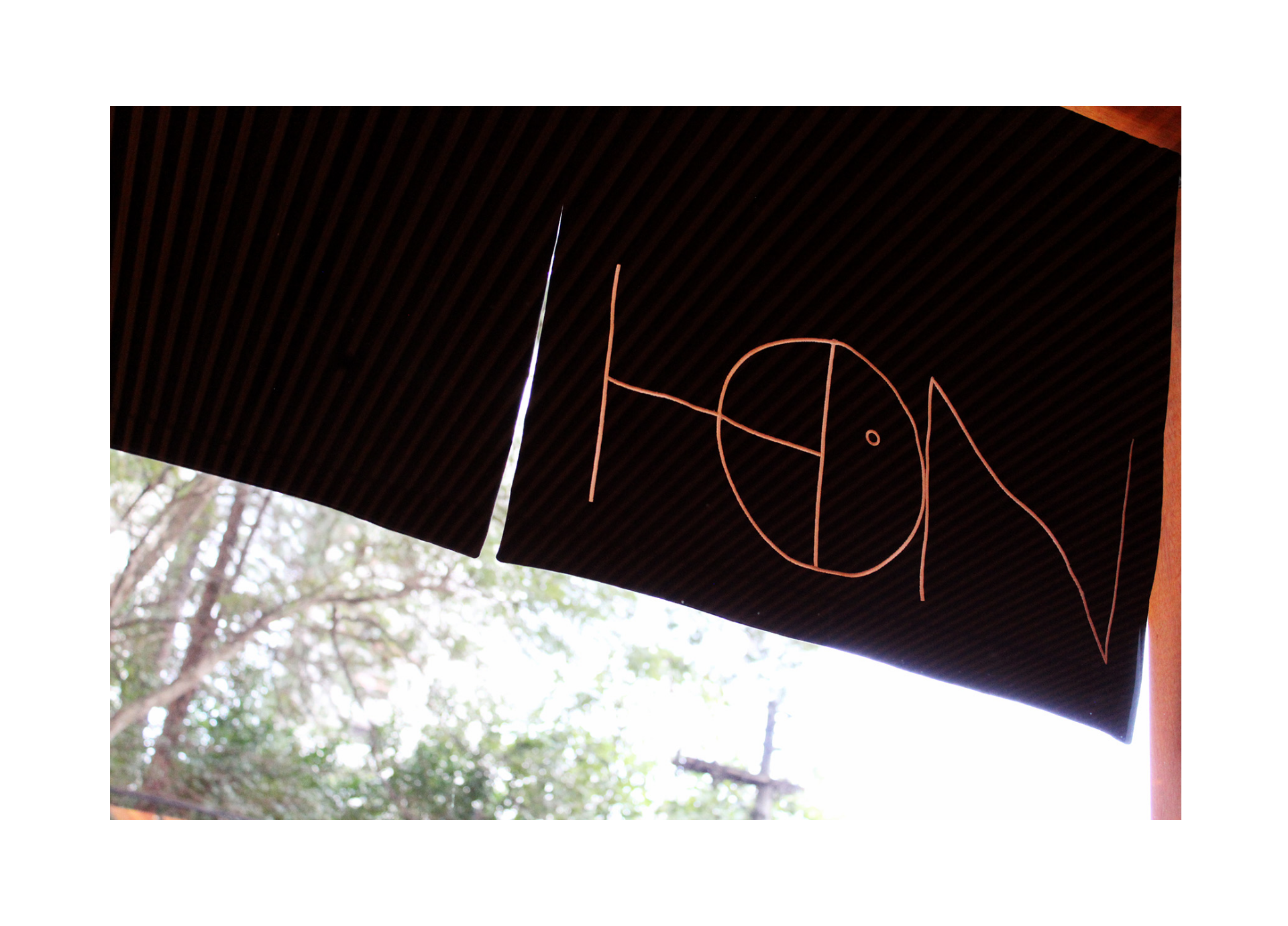
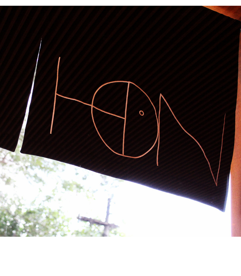
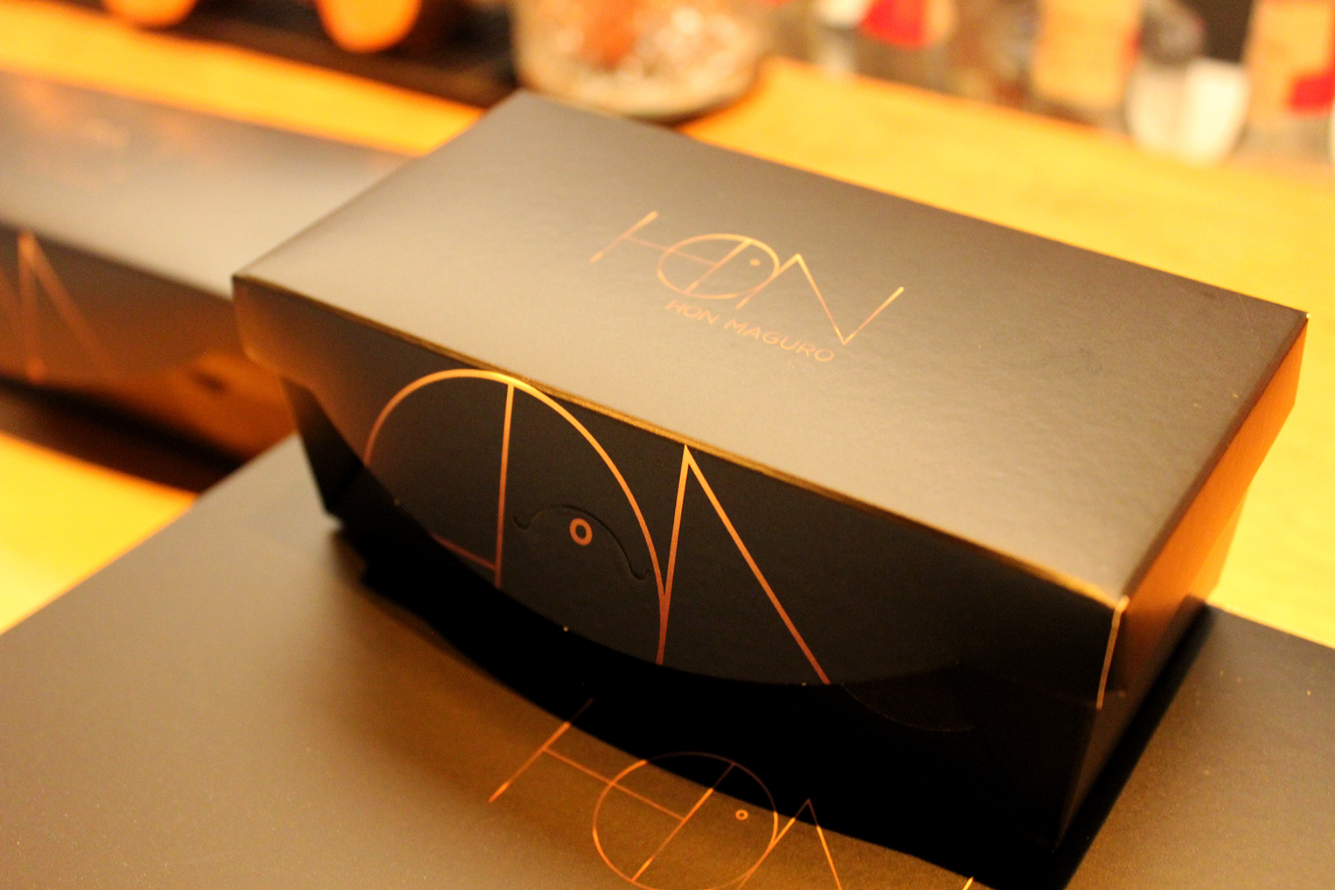
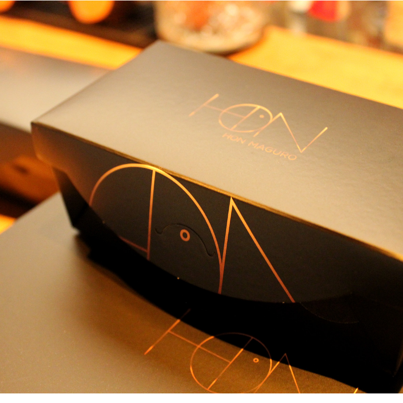
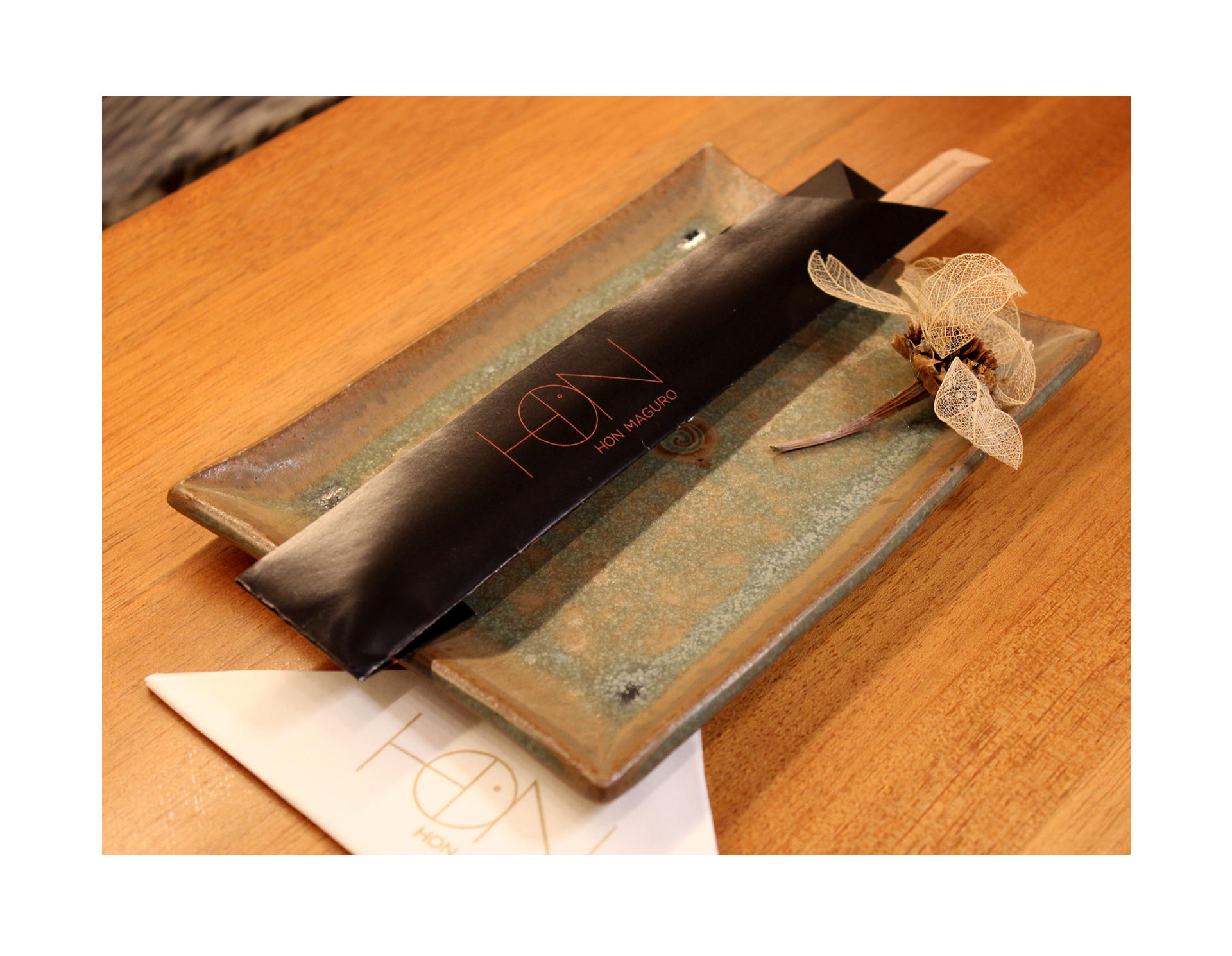
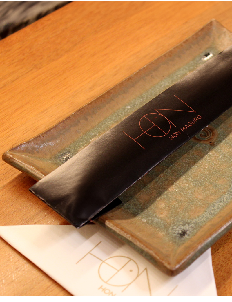
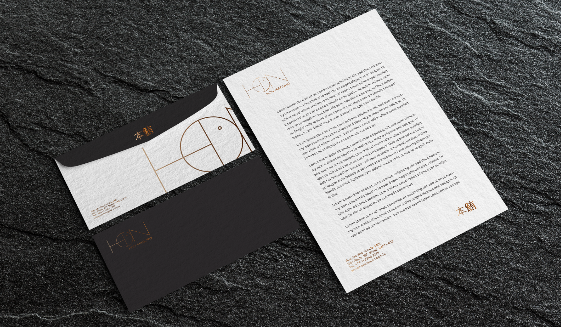
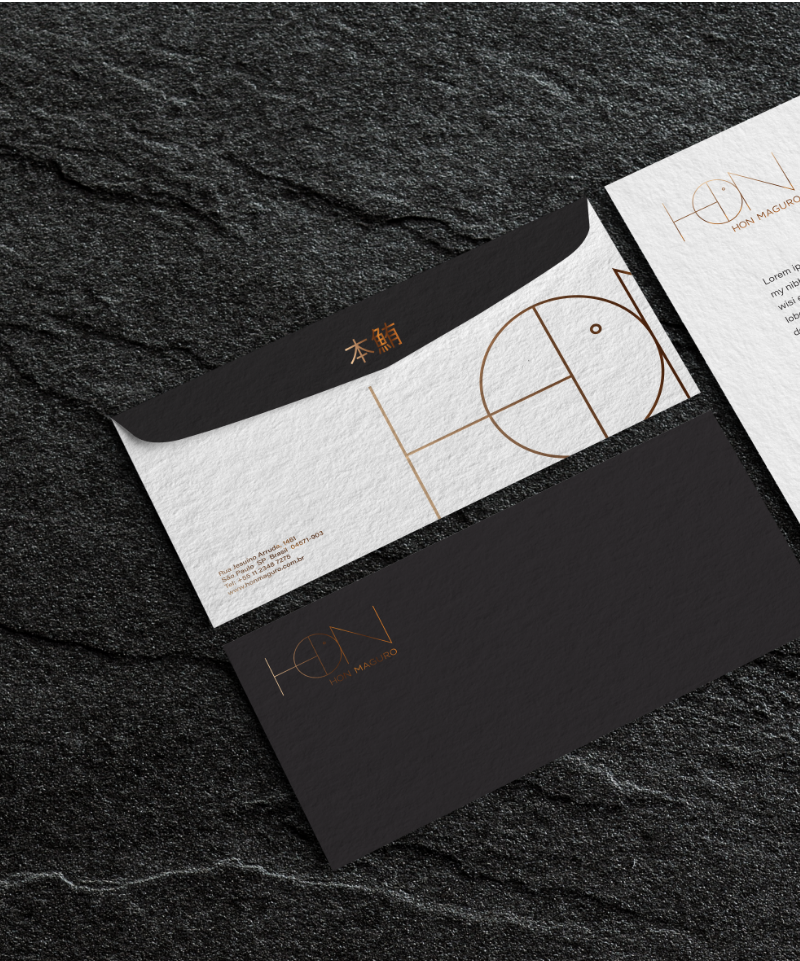
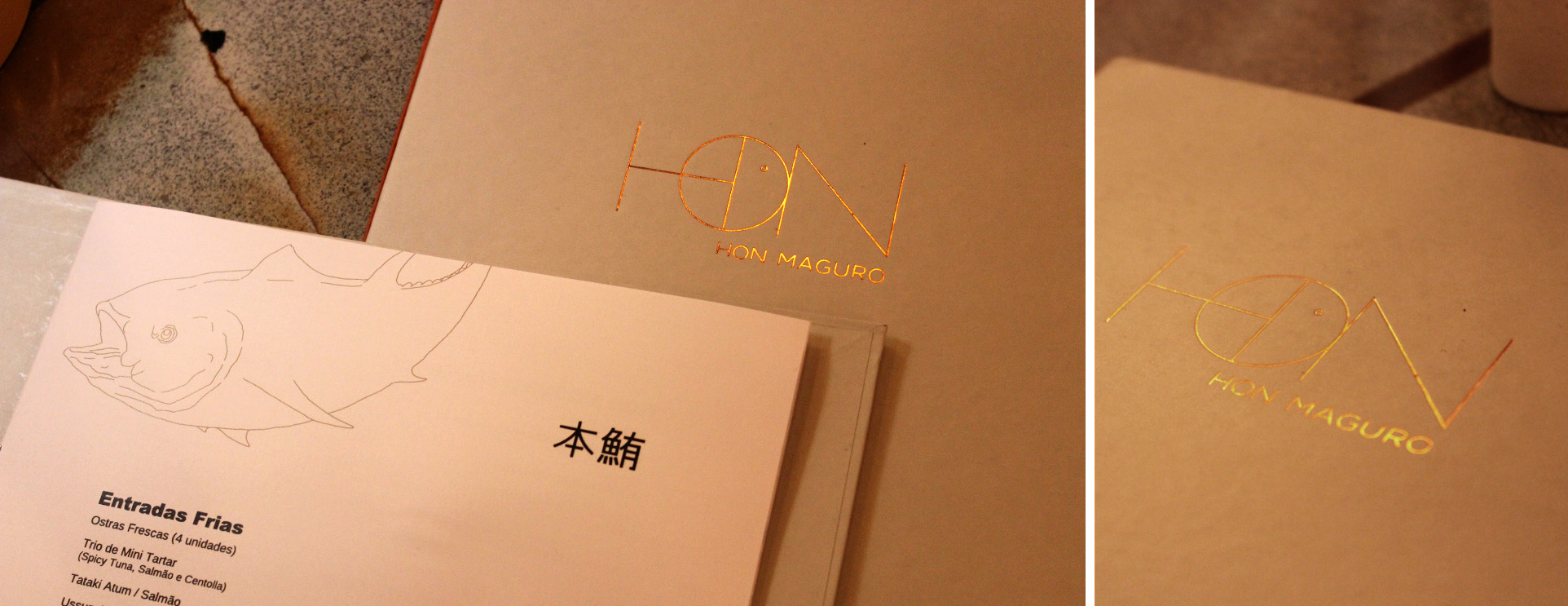
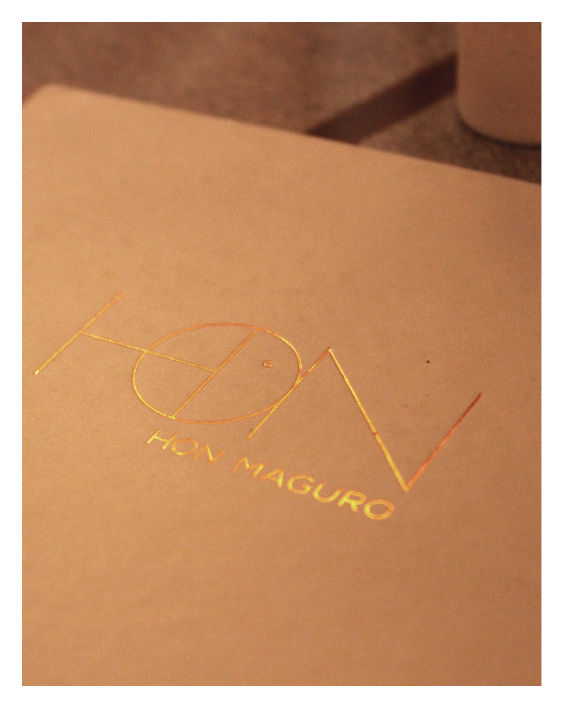
We designed the entire visual identity of the upscale Japanese restaurant Hon Maguro. Its name comes from the Bluefin tuna, considered one of the most precious and popular fish in Japanese cuisine, thanks to its unique texture and flavor. The brand subtly incorporates the stylization of a 'hidden' fish within the typography of its logo.


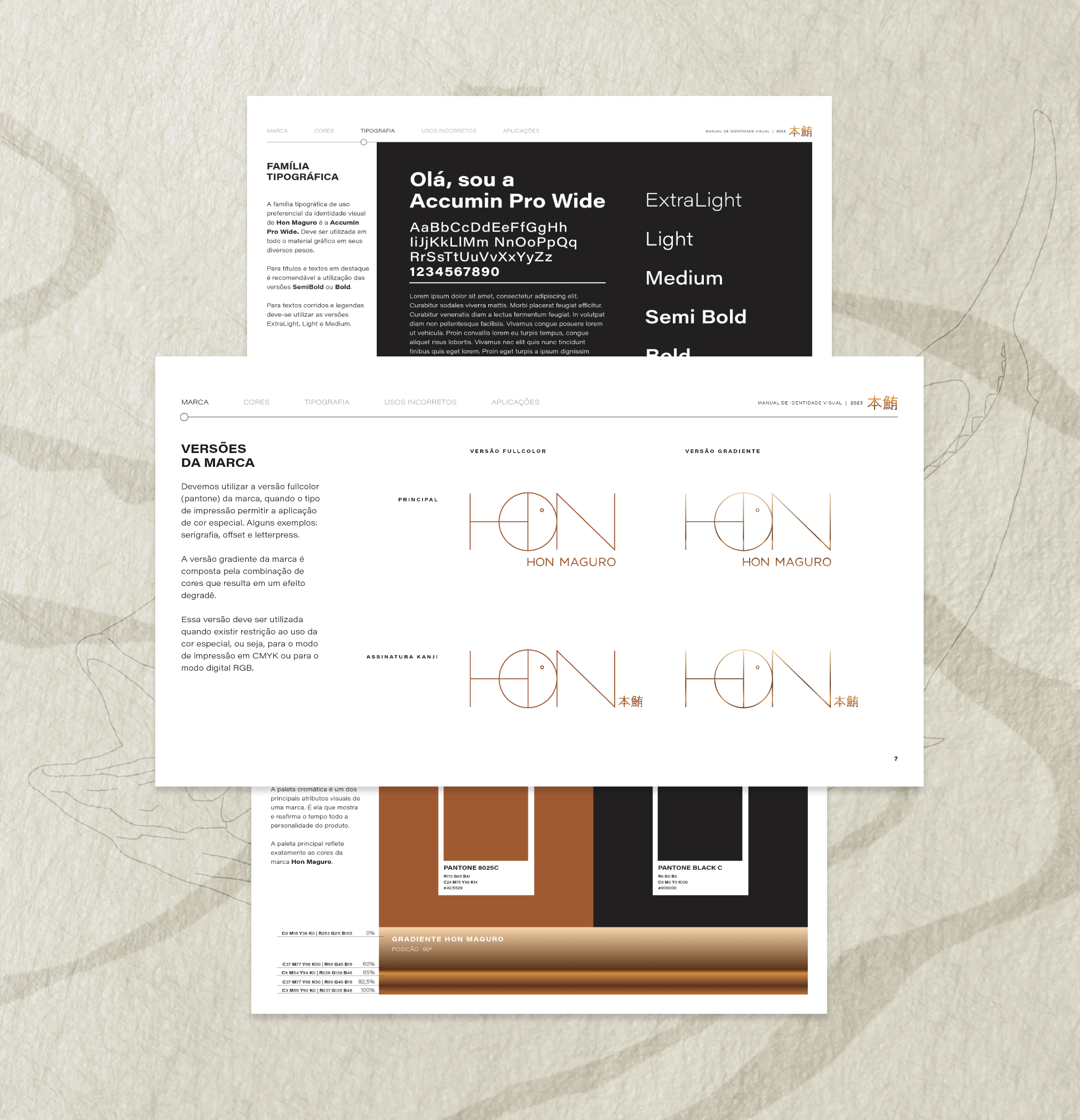
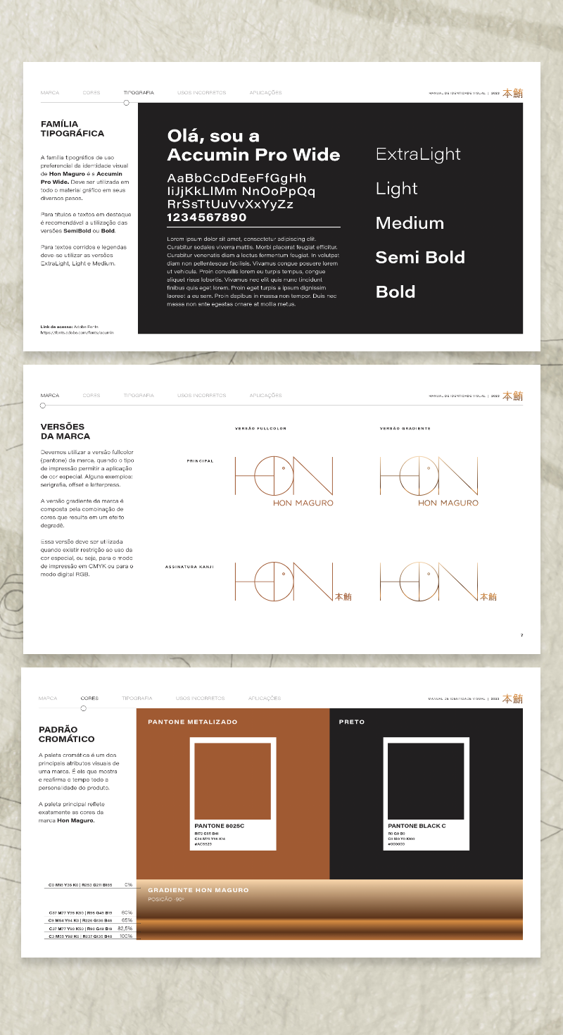
In our printed materials, we emphasize minimalism. We value the gradients and shine of our brand, whether directly in print or through graphic production finishes.

In the digital realm, one of our focuses was to bring the rich atmosphere of the environment together with a comfortable user experience, enabling quick access to desired content.
who made
it happen

Vannucchi

Mazini

Keating

Senra

Mange

Oliveira
check out
other cases

We use cookies to improve your experience on our website. By continuing to use our website, you agree with our Privacy Policy.