Prata
Packaging
Corporate Id.
prata premium mixers
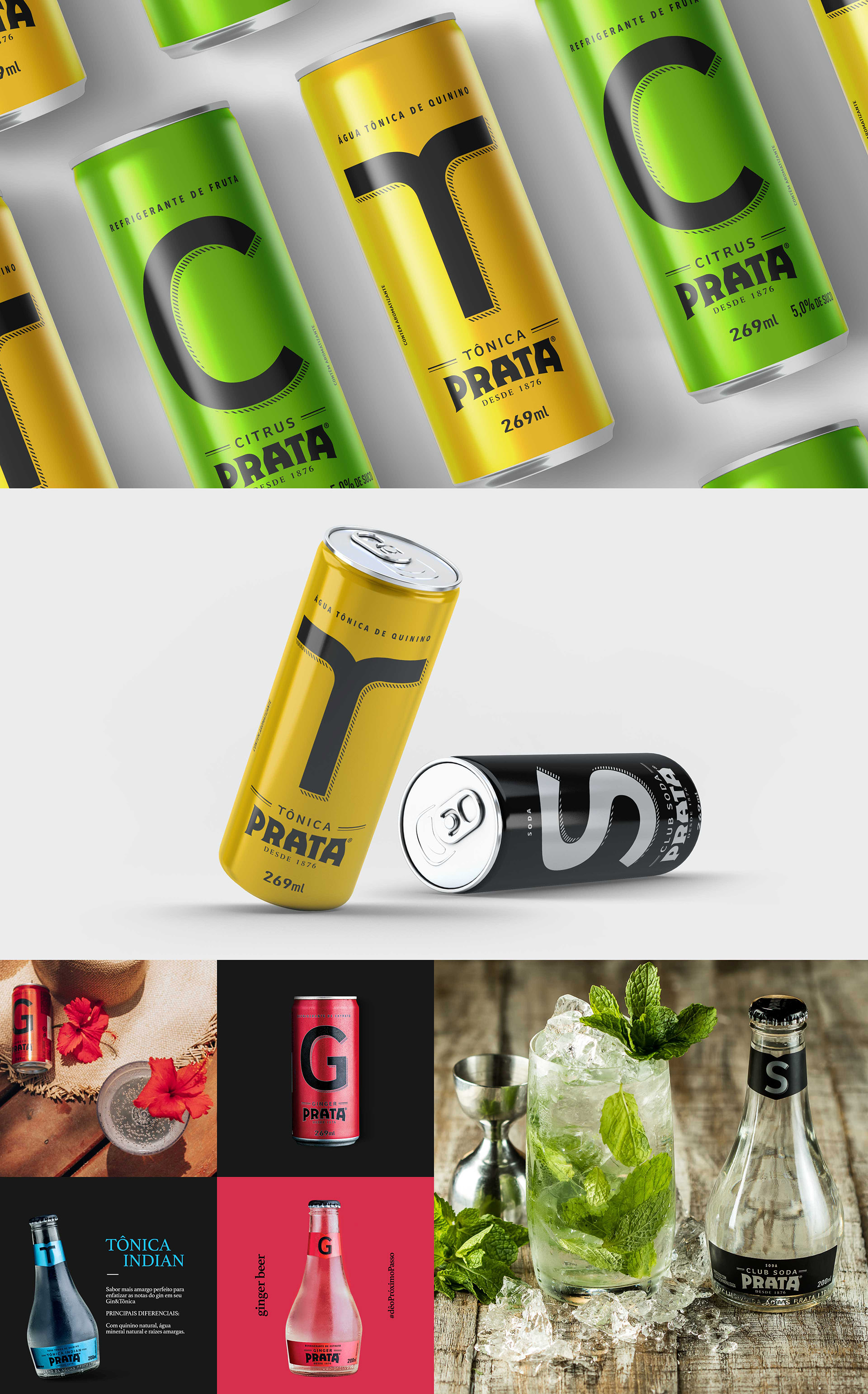
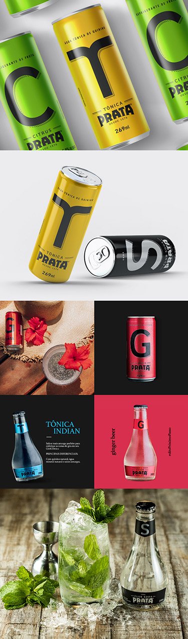
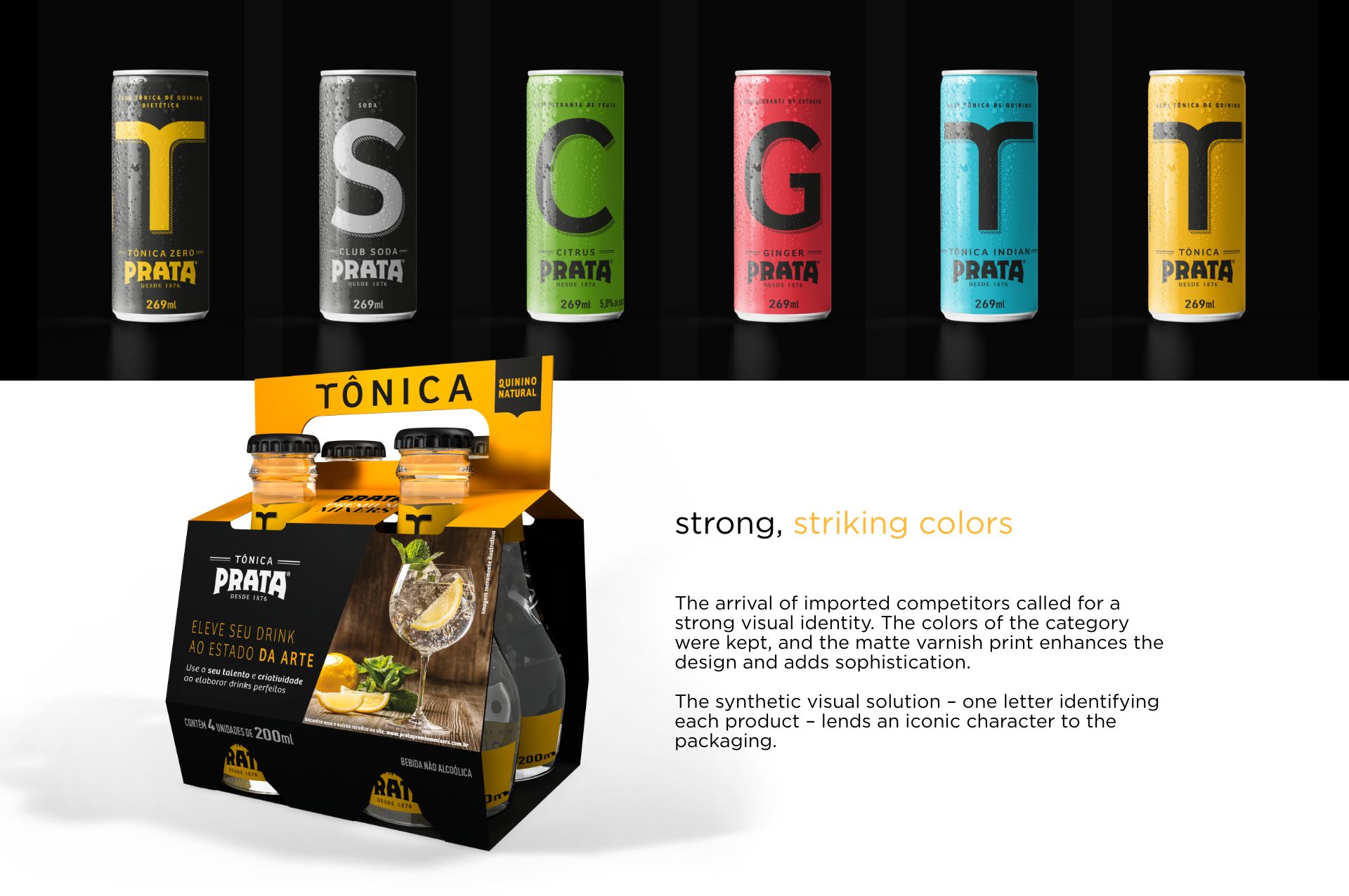
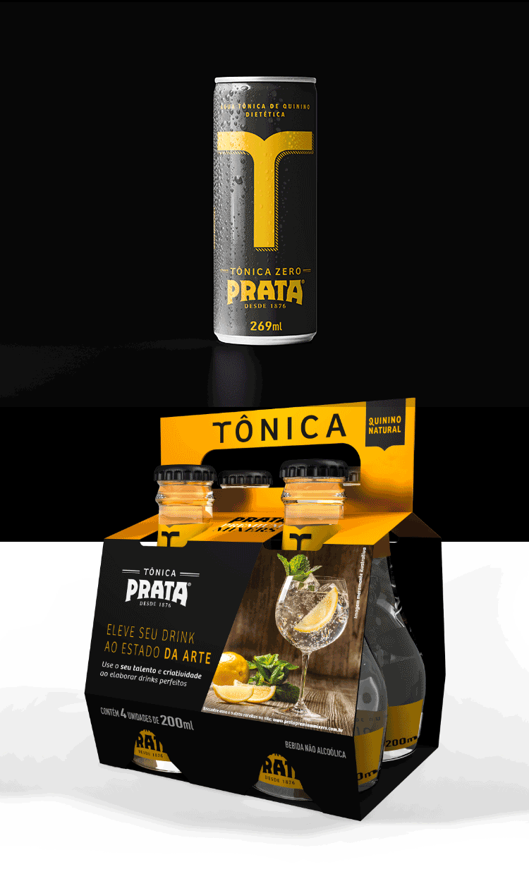
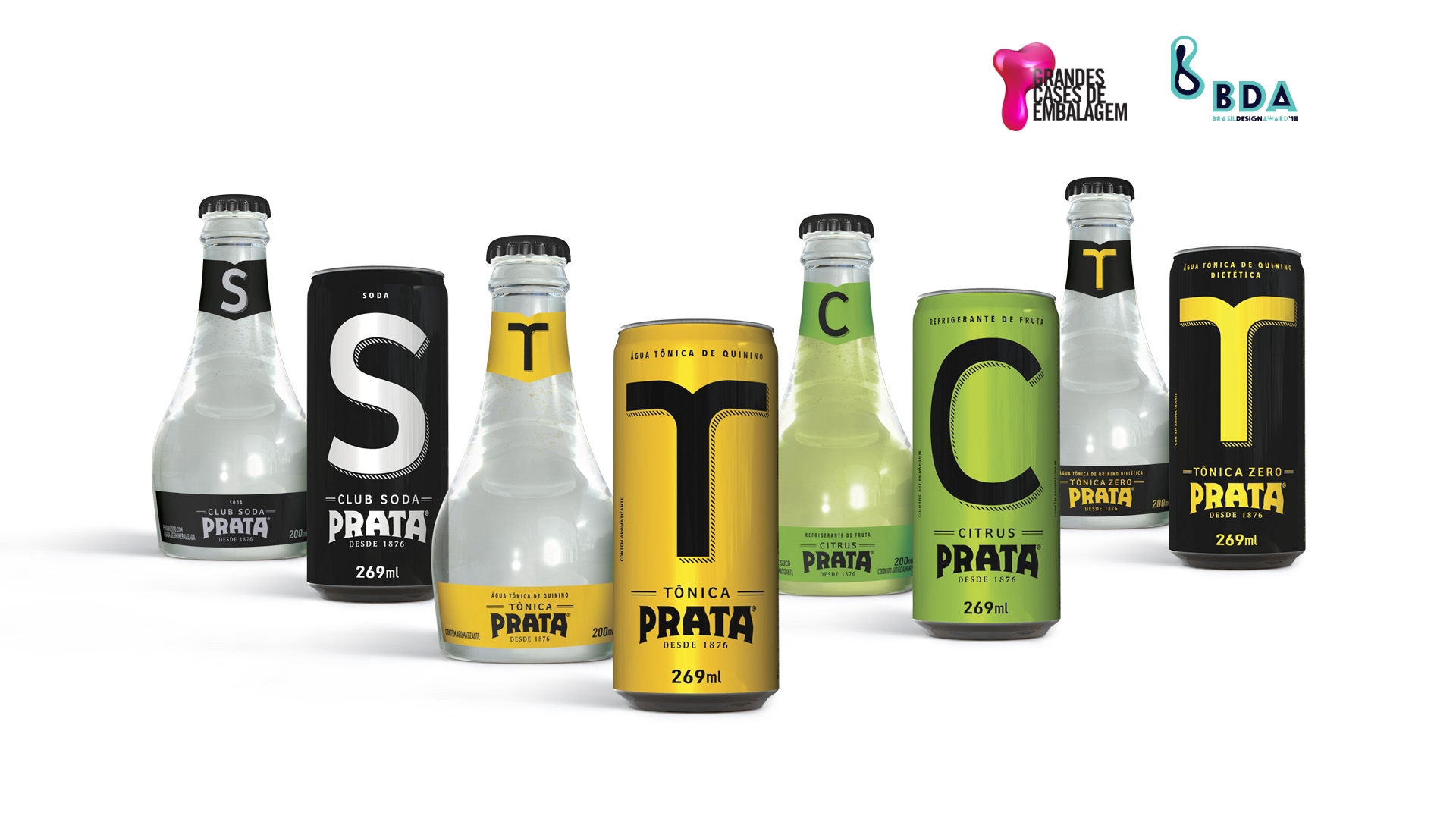
We were behind the development of the new visual identity and the new packagings for the relaunch of Prata Tonic Water, a product mixologists acknowledge as possessing a degree of purity and lightness that makes it ideal for combining with drinks.
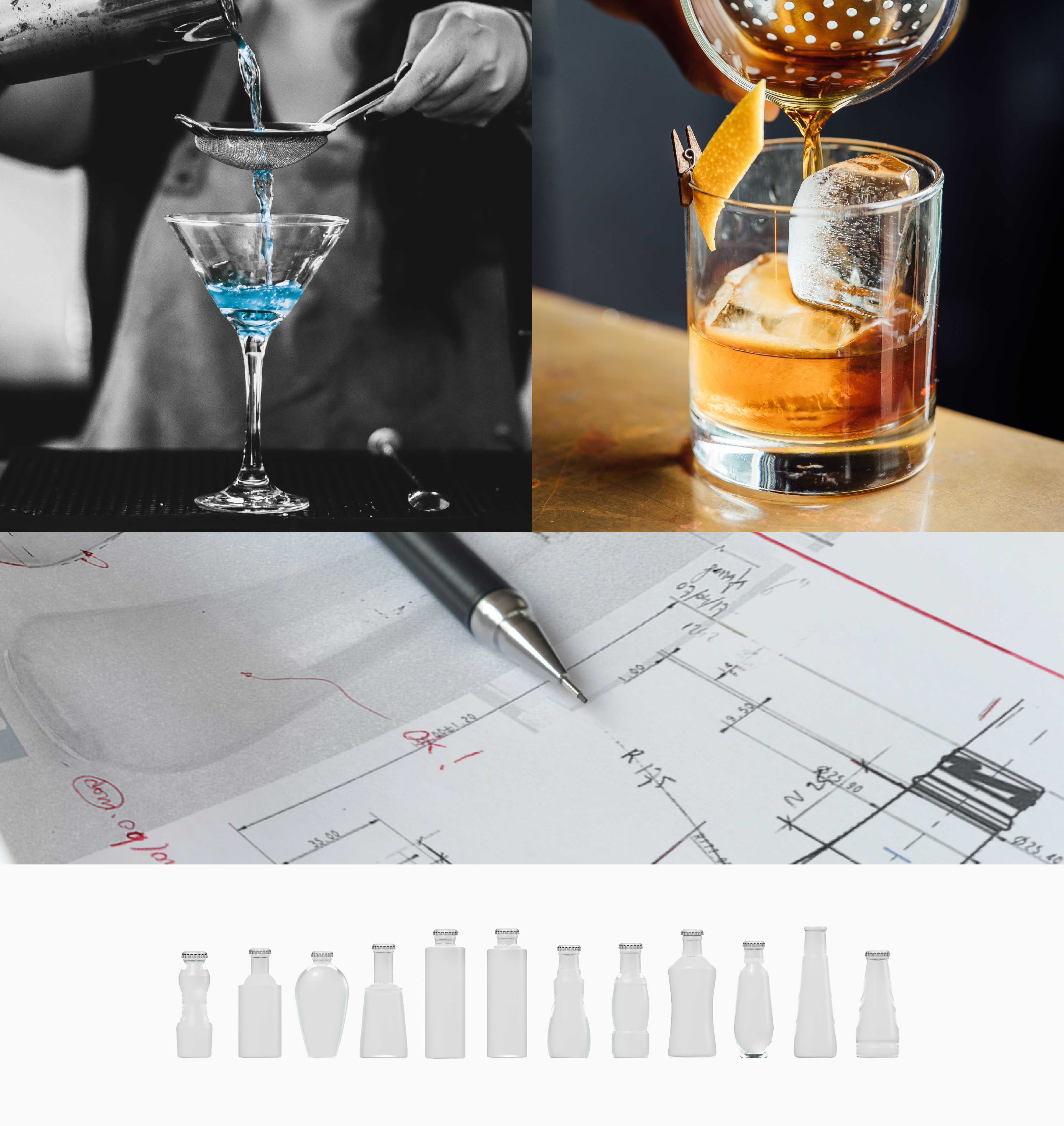
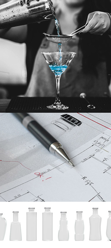

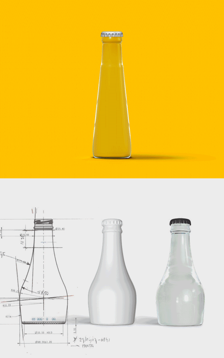
As such, we distanced the beverage from the soft drinks category. The new visual identity, synthetic and bold, brings it closer to the universe of nightlife and drinks, consumed by young adults. The new shape of the bottles, proprietary and refined, was calibrated for good ergonomics in handling and adjusted to the optimal size to prepare standard drinks, thus preventing waste.
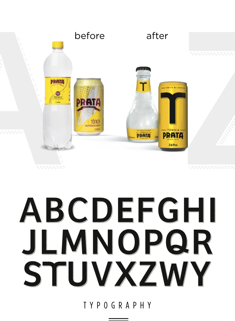
We developed a proprietary font that would convey a bold look'n'feel, close to the mixology universe. As with the new shape, designed specifically to adapt to the preparation of doses and drinks.
who made
it happen

Vannucchi

Mazini

Franco

Dias

Amorim

Garcia
check out
other cases
We use cookies to improve your experience on our website. By continuing to use our website, you agree with our Privacy Policy.